Finding the right balance is what turns a collection of walls, floors, and furnishings into a home that feels intentional. One of the simplest, most effective frameworks is the 60-30-10 rule in interior design—a timeless formula that transforms chaotic spaces into calm, cohesive ones.
Too much color can make a room feel like a carnival funhouse. Too little, and the space falls flat. Finding the right balance is what turns a collection of walls, floors, and furnishings into a home that feels intentional. That balance begins with proportion. The 60-30-10 rule is one of design’s simplest formulas, yet it has the power to transform even the most chaotic rooms into calm, cohesive spaces.
Think of it as a framework for harmony: sixty percent dominant hue, thirty percent complementary shade, and ten percent accent. The floor becomes part of the composition, grounding everything else in the palette. Whether you lean toward warm, sun-washed tones or cooler Scandinavian greys, the 60-30-10 rule gives you a structure to layer color with confidence. It’s a guide that works across styles, budgets, and moods—from timeless monochrome to playful, seasonal accents.
Why Rooms Feel “”Off”—And How 60-30-10 Fixes It
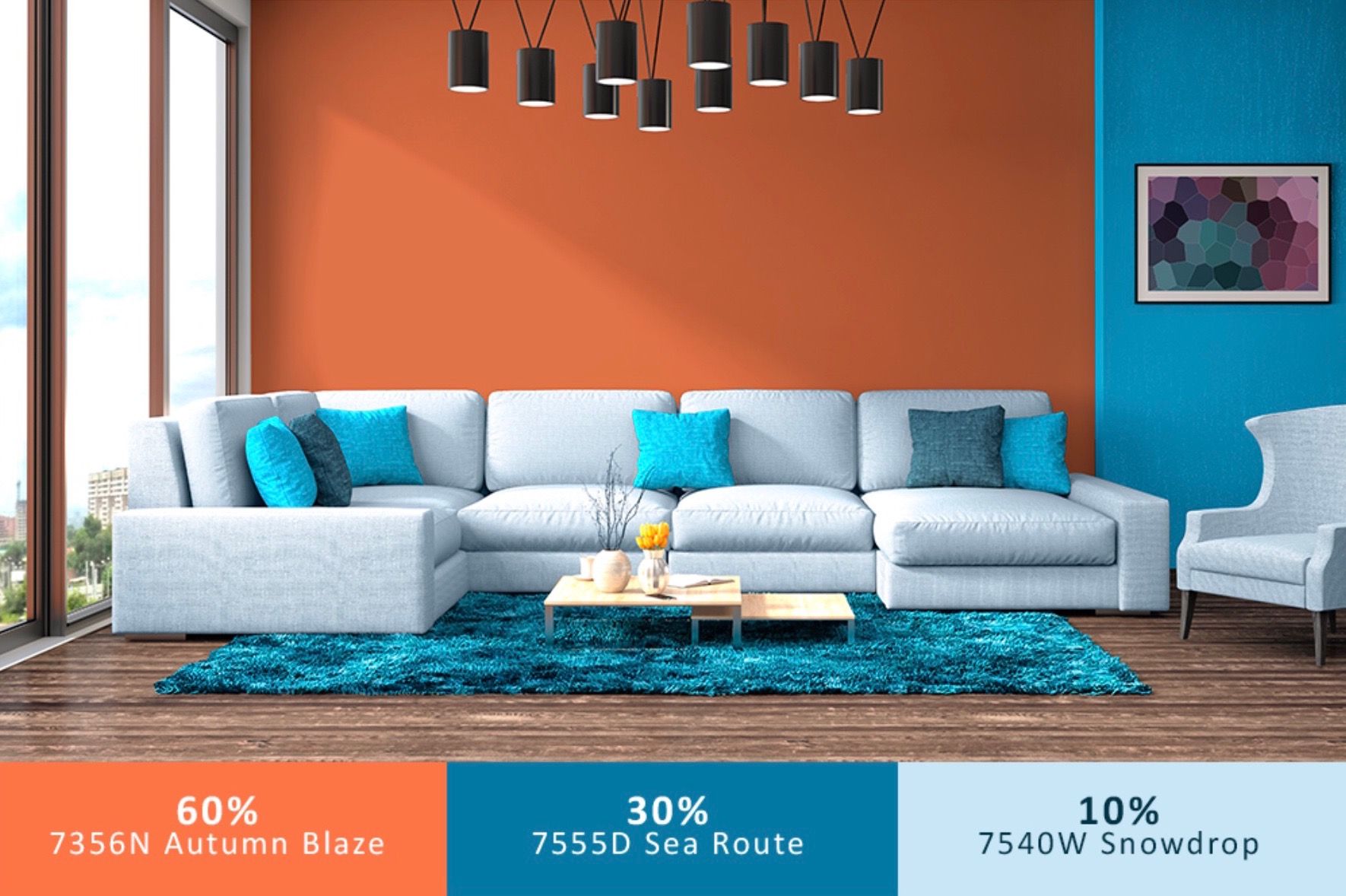
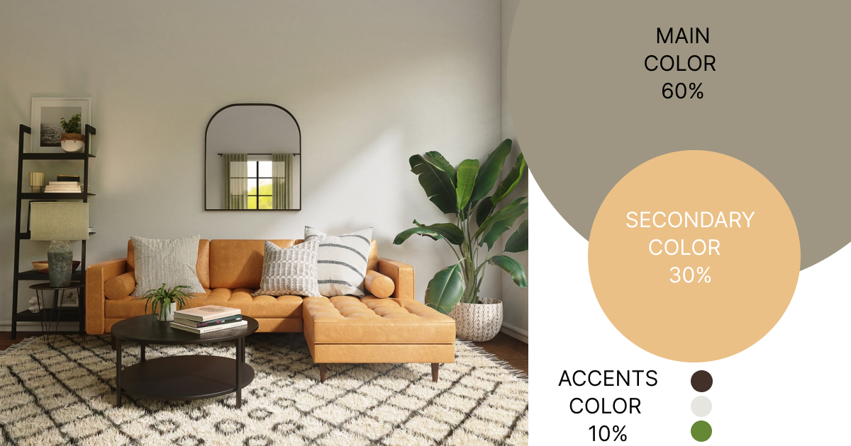
60-30-10 refers to the percentages of a given color used to decorate a living space. To simplify color choices, you’ll use 60% of a dominant or primary color, 30% of a secondary color, and 10% of an accent shade or color. The idea is to show you how to balance color in a room using your favorite colors. You can experiment with the entire color palette, but choose colors that mingle and complement one another.
The majority of the room’s color, 60%, will include the walls, larger pieces of furniture like a sofa or bed, and an area rug. One way to visualize is to walk into a room and squint your eyes. What is the predominant color or shade that you recognize? That will be the primary color.

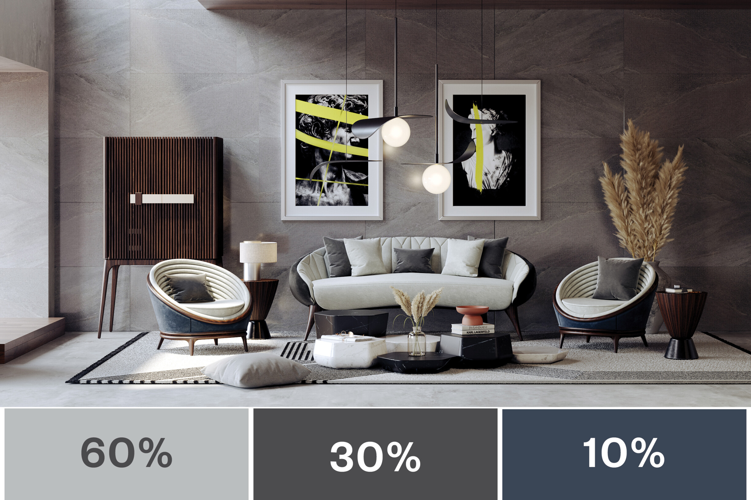
The secondary color, or 30%, will be things like smaller furniture, bedding, drapes, or an accent wall. It should be a contrasting color or shade. Make it a bit bold but don’t take away from the primary color.
The remaining 10% of your color scheme is the fun part. You can put up wall art, paint doors, and add throw pillows, candles, and all the little goodies to create splashes of color all over the room.
What the 60-30-10 Rule Actually Means
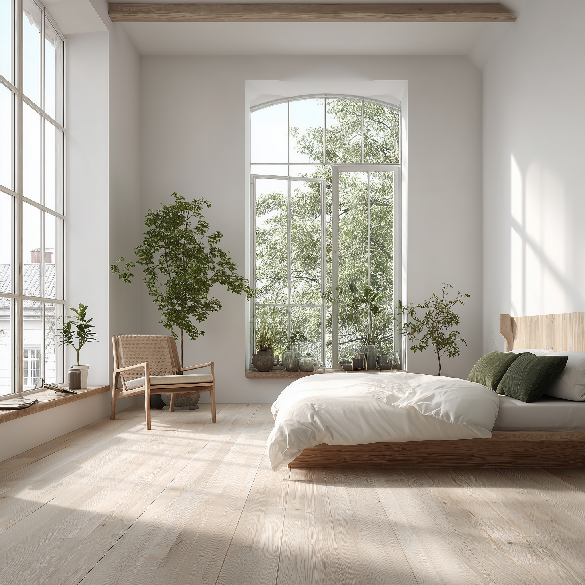
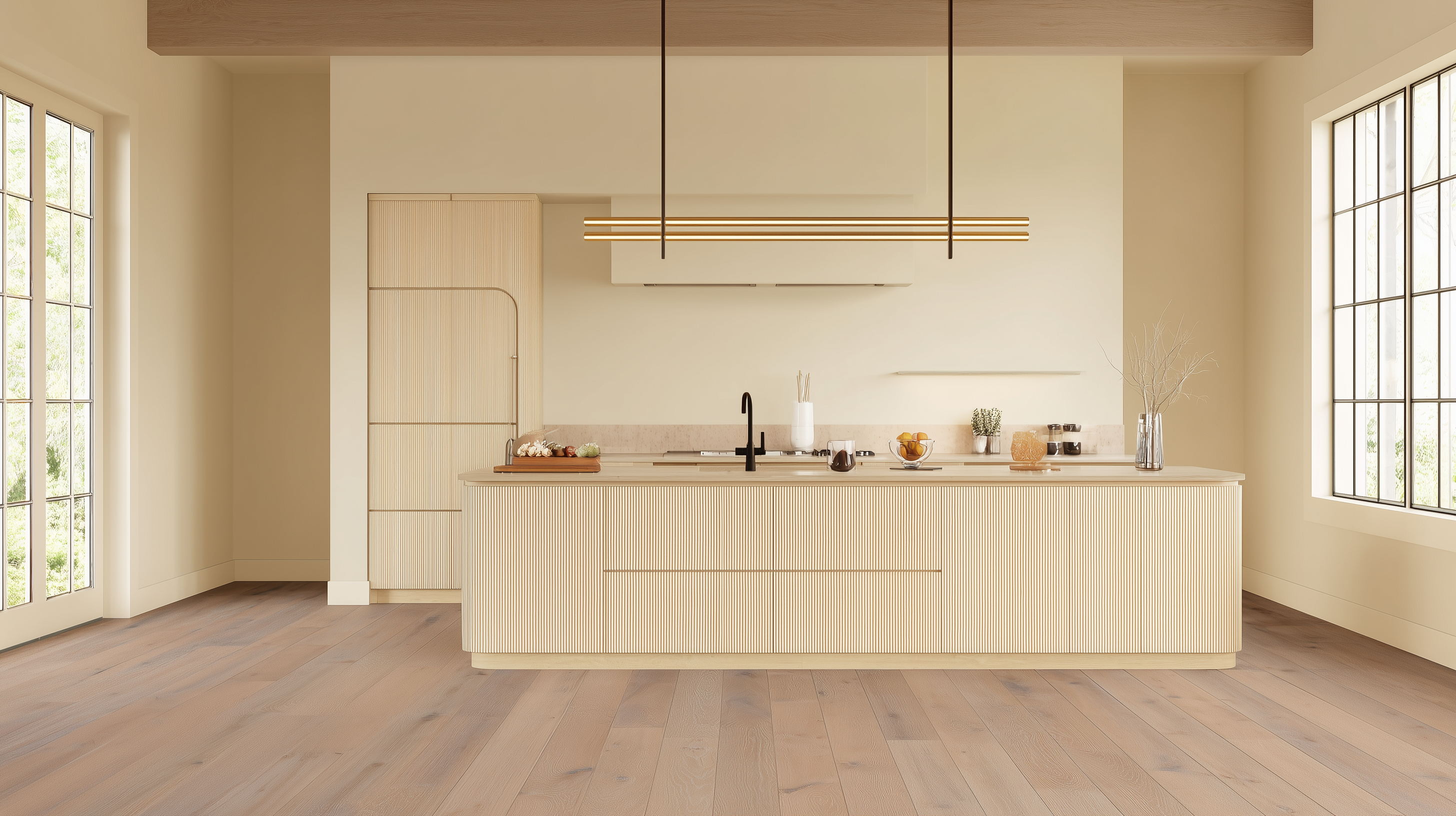
When applying the 60-30-10 rule in interior design, don’t forget that your hardwood floors are part of the palette. When considering matching or harmonizing colors in your home, consider the hardwood floor as part of your color scheme. Floors and walls must complement each other as they are the largest areas in any room. Usually, your wall color should coordinate with the floor. For example, regardless of the shade, if you have a hardwood floor, use a neutral shade of paint to match. It’s part of the 60%.
Think of the primary color as a blank canvas for the rest of your artistic design. Most of the walls, large pieces, and the sofa will most likely be in the same color range.
The secondary color is half as much as the primary. Spread the 30% color theme throughout the room or an accent wall. Make it a color or shade not too far from the primary color.
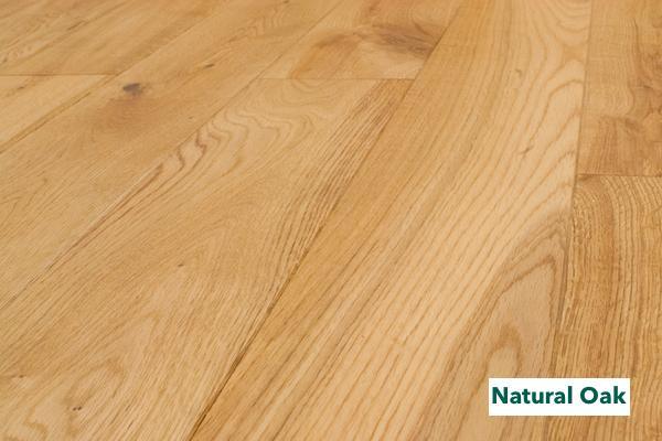
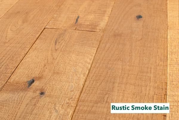
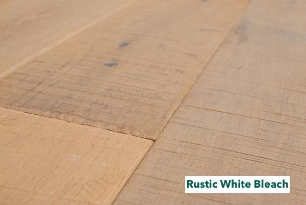
A natural finished oak hardwood floor can also be a complementary color for either the primary or secondary. Unfinished oak hardwood floors accept stains well. You can bleach them almost white or stain them to add contrast.
Use the principles of color design and let your creative juices flow with the remaining 10% of your color. What’s fun is you can change the color to fit your mood or the change of season. It keeps your room looking fresh without major changes or breaking the bank.
Bending the Rules Without Breaking the Room
The 60-30-10 rule is a guideline, not a federal law. Have fun and play around, especially with the accent colors. If you need more than three colors to match your personality (or your client’s), add another. In other words, make your color scheme 110% - 60%, 30%, 10% plus another 10%. It’s OK to add a fourth color, as long as it enhances the other three.
Before you start breaking the rules, make sure you understand the colors and how to use them. There are two categories, warm and cool.
Warm vs Cool: Read the Room
Understanding warm and cool tones helps you apply the 60-30-10 rule in interior design more effectively. Home design magazines and designers are always talking about warm and cool colors. Understanding what they are and how to use them will help you choose the right colors for your home decor project.
Warm Colors
Do you remember the seven primary colors of the spectrum from your high school science class? Shining a white light through a prism turns it into a rainbow. You remembered the color and wavelengths using the name... ROY G BIV. It stood for Red, Orange, Yellow, Green, Blue, Indigo, and Violet.
Warm colors are the “ROY” side of the spectrum and remind you of a warm fireplace or romantic sunset. Use orange, red, yellow, and all the combinations. Some designers consider terra-cotta or brown as warm colors, too, making a large room feel cozier.
Cool Colors
Cool colors are on the G BIV side of the spectrum. Blue, green, and light purple make you think of snow, ice, and cool, deep ocean waters. Use lighter shades of cool colors to make small rooms look larger and more spacious. Typically, bedrooms are a great place for soothing, calming, cool colors.
Design Your Own Ratio
Now that you’ve been refreshed on the color spectrum, you can devise a custom paint decorating formula just for you. You have 100%, why not go with 50-20-20-10? Or, how about 30-30-20-20? It’s up to you.
Before you go out and load up on paint, download an app and experiment with the colors you envision. Do they match or clash? It’s OK to change the proportions. Just keep everything in balance.
Six of the biggest paint and stain manufacturers have apps where you can visualize exact colors in a sample room or upload a photo of your room. In all, you can find eleven color choosing apps in this article. Try one or two and get just the right colors before you buy paint. The best part is that you’ll have the exact code number for that color and manufacturer.
Another way to visualize accent color and pieces is the IKEA Place virtual reality app. Place different furniture, rugs, and accessories around your room using the mobile app. Instantly visualize how it will look.
Monochrome Done Modern
If you like your design to be understated but elegant, then a monochromatic color scheme is the right choice for you. Although monochromatic means only one color, you can use different shades for a classy, modern look.
Typically, a monochromatic look will use a neutral color in the whites and beiges. However, pastel colors can also work well for a relaxing atmosphere.

And then there is the latest color creation for interior design... Greige.
Yep, Griege is a Thing
If you haven’t heard of “Griege,” you will. It probably started as an accident, but it’s become quite popular. Gray + Beige = Griege. It’s neutral, goes with any other color, and you can safely use it for your primary color.
One hardwood flooring style that goes well with this is a Greywash, 5-inch, solid oak hardwood floor. It’s the perfect blank canvas for adding feature furniture and rugs with any color or pattern.
Greige makes a perfect second or third color option to more colorful paint as well.
Pro Tips to Nail the 60-30-10 Look
These practical tweaks show how flexible the 60-30-10 rule in interior design can be, leaving plenty of room for creativity. Don’t get stuck on the 60-30-10 color rule. Spread your color wings and fly using these tips to help you achieve a sophisticated and professional design look.
- Use two shades of the same color - For example, if you have blue as your primary color, use a combination of light blue and navy blue as part of the 60%.
- It’s OK to use additional colors - If your color palette is white, greige, and navy, you can still use a pillow that has other colors in it. Try to have the dominant color match the primary. The different colors merely add character.
- Split the 10% accent color – It’s your party, so be bold! Use two colors as your accent, about 5% each.
It’s a quick way to design a tasteful, modern space using the easy-to-follow 60-30-10 color rule.
A Formula That Leaves Room for Creativity
The 60-30-10 rule isn’t about restriction, it’s about balance. It offers a simple structure for those who feel overwhelmed by color yet leaves plenty of room for experimentation. By grounding a room in one dominant hue, layering in a secondary shade, and finishing with thoughtful accents, you create a space that feels both curated and comfortable.
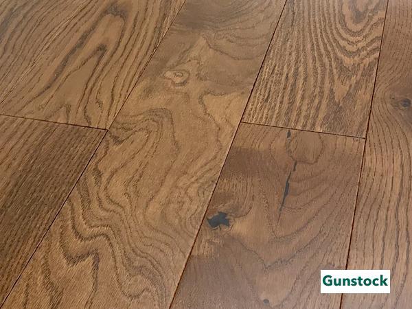
Floors, often overlooked, are the natural anchor in this formula. A solid oak in its natural finish, a soft greywash, or a deeper rustic stain can serve as either the 60, the 30, or the quiet accent that ties everything together. Once you see your floors as part of the palette, designing the rest of the space becomes more intuitive.
The beauty of this approach is its flexibility. You can keep it minimal with a monochromatic scheme or introduce an unexpected twist with seasonal accessories or bold accent pieces. And when trends evolve — from the rise of greige to the return of earth tones — the rule adapts. The result is a home that feels timeless, layered, and deeply personal.
Shop the Collection
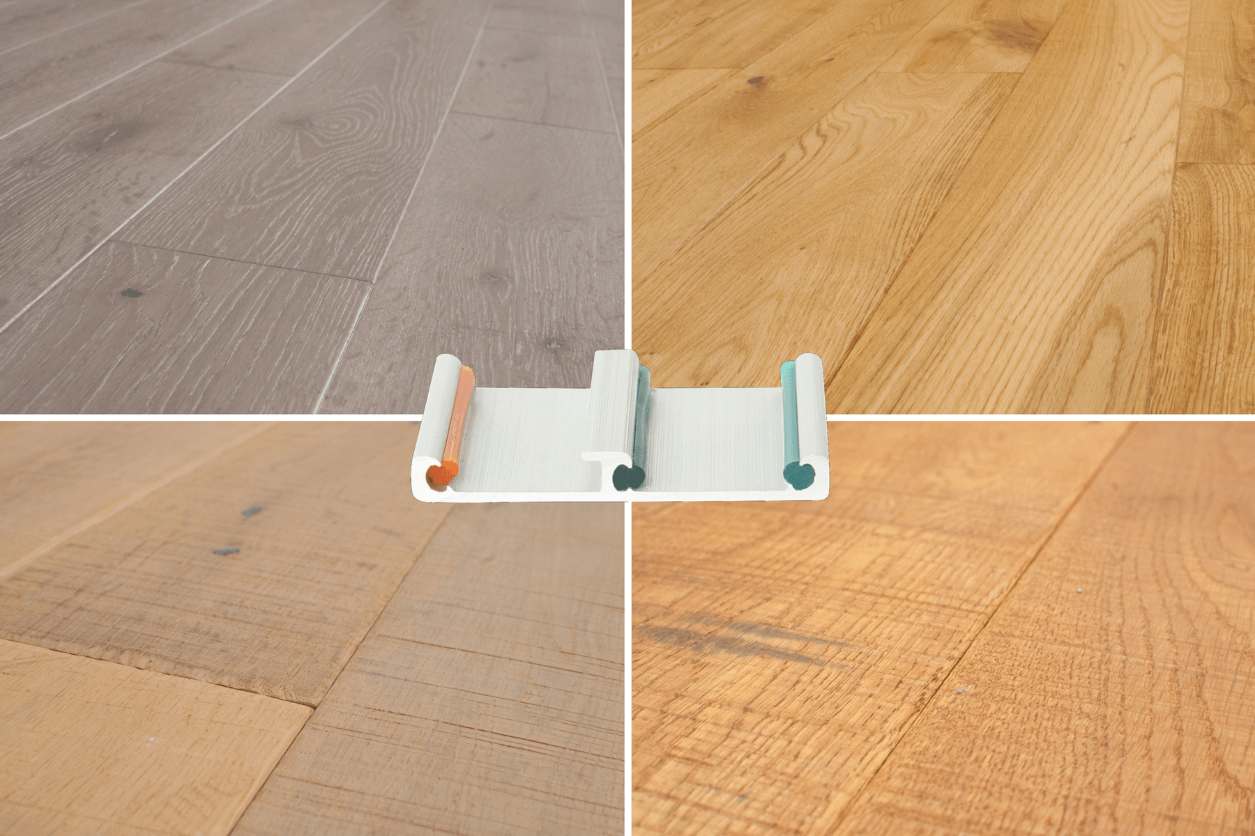
Explore solid white oak floors that harmonize with any palette and install without nails or glue. Order a free sample pack and test finishes under your own light.
-
Shop the collection: https://easiklip.ca/collections/all
-
Request a sample pack: https://easiklip.ca/products/easiklip-sample-pack
